As a member of the local driving instructors association, Nick has been commissioned to produce an updated corporate image for the group. Formed only a few years ago, the initial logo was designed by an early member and whilst it did the job, the logo looked dated in 2022.
The design process took in a period of research, looking at other associations to find a logo concept which couldn’t be confused with other groups in the same space. Initial research and sketching took over a month of work before Nick began designing a number of options for the client to chose from.
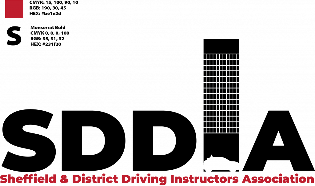
The first design concept was to include an iconic building from Sheffield into the logo design. Options included the Crucible Theatre, Sheffield’s winter gardens building, the Park Hill flats and the University of Sheffield Arts Tower building, one of the tallest buildings on Sheffield’s skyline.
Looking at the available buildings, the Arts tower jumped out immediately. The first concept included the Arts tower in place of the I of the SDDIA. The first draft looked good but didn’t scream driving instructor; version 2 added a driving school car silhouette in the base of the tower.
Those that are interested, the car is a 2020 Peugeot e-208 with a driving school top sign.
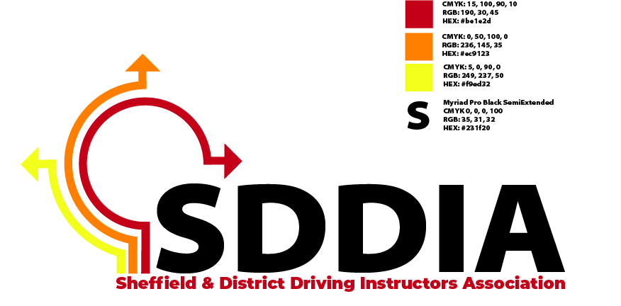
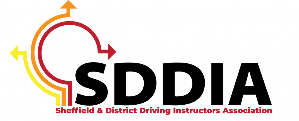
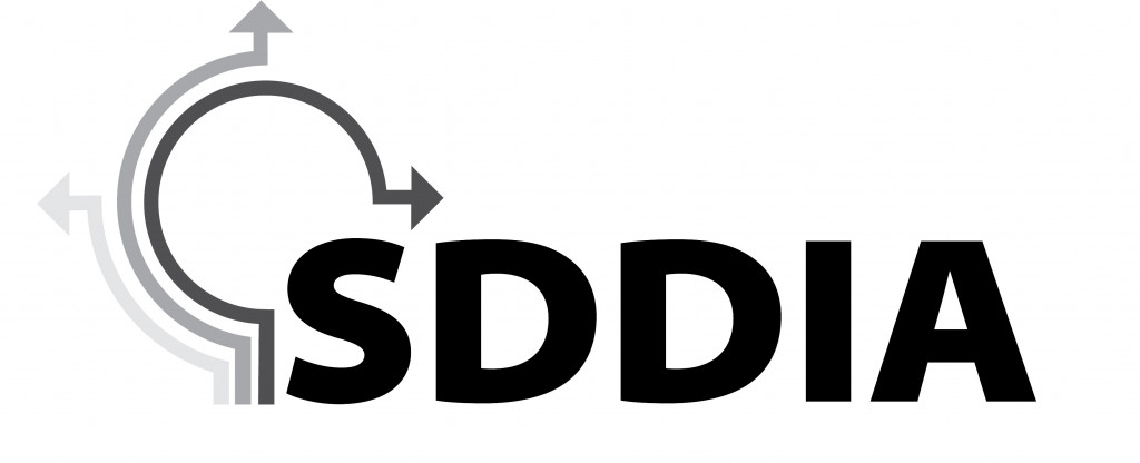
The second design concept is more generic but has significance beyond the driving task. As with option 1, the name and approved acronym for the association takes centre stage. Unlike the first option, the graphical component is separate which allows for alternative uses of the image. While anyone who drives will immediately recognise the graphic as three routes through a roundabout, the image also has secondary significance; it points to the signposting function an association serves in a mainly solitary industry.
On feedback, the full association name was added below the logo to strengthen the entities name in a logo which otherwise, could be used to suggest any driving instructors association or civil engineering company.

Option 3 was again a generic logo which had been made more specific. In this example, given the highly generic nature of the graphical component, the full name was given pride of place in the graphic. The image attached represents an Approved Driving Instructor’s licence, a Potential Driving Instructor’s licence and the badge issued to members of the Official Register of Driving Instructor Trainers (ORDIT).
Other concepts with a combination of the Fleet Trainer’s badge and also another logo incorporating a driving school car and articulated lorry were also trialed but failed to make the final three options presented to the client.
Final Approval
The three options were offered to the associations organising committee. This committee opted to put the logo choice to a vote of the members and at the associations AGM in May, those assembled had the option to vote for the logo of their choice. Whilst all logos got some votes, the final decision was overwhelmingly in favour of the second option. This logo has now been adopted as the logo of the association and is used in all official communications.
The logo has also been deployed across the groups social media channels and in printed matter including receipts and Continuous Professional Development certificates, issued for the first time this week to members and non-member delegates to a course hosted by the association.